In brief
- Choose by reader, question and cadence — not by which feels more modern.
- Dashboards triage; reports interpret. Most client relationships need both.
- Keep periods, definitions and refresh habits aligned so the two views agree.
Contents
“Should this be a dashboard or a report?” is really two questions: what is the reader trying to do, and how often do they look? Get those right and the format chooses itself; get them wrong and you end up screen-sharing a monitoring view through a strategy meeting, or maintaining a narrative nobody re-reads.
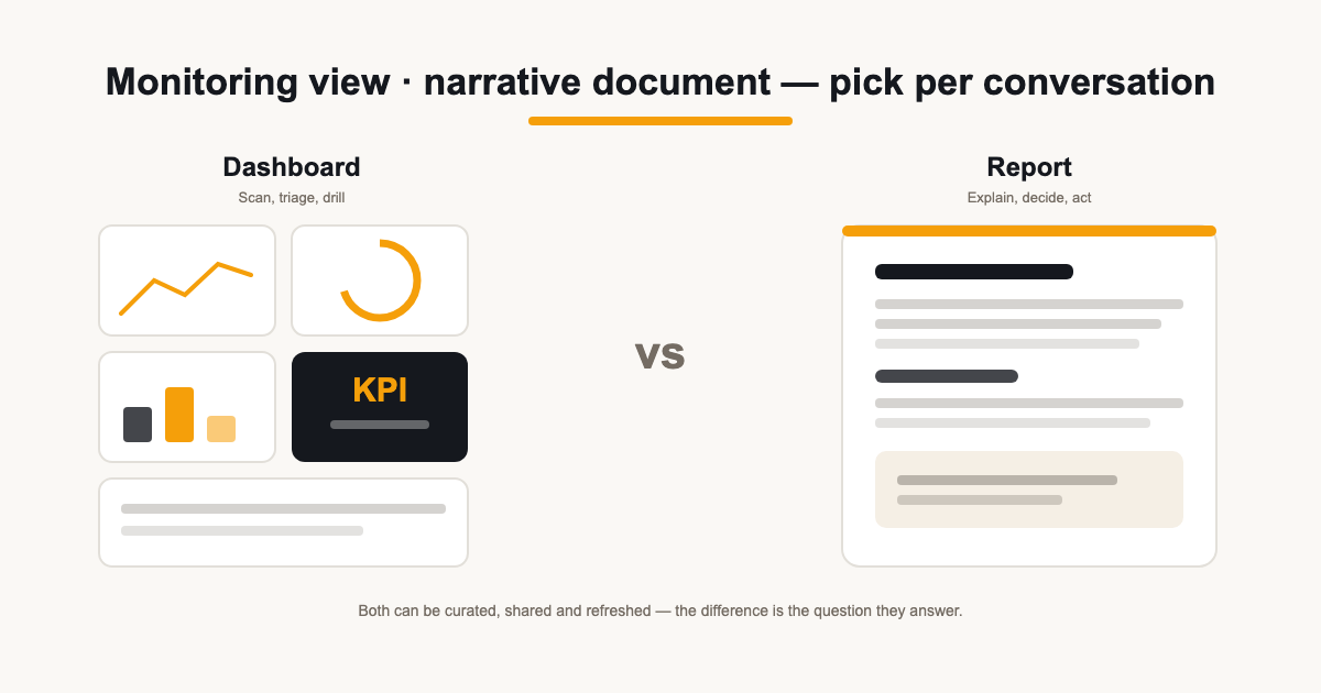
The common stereotype — dashboards are live, reports are stale — is too simple to be useful. Both can be curated, shared, refreshed and read on a phone. The real difference is the job: a dashboard answers a question you ask repeatedly; a report tells a story you deliver once per period.
Start with the reader, the question and the cadence
Three questions decide the format. Who looks at it — you, an account manager, the client's marketing lead, their MD? What are they trying to do — spot a problem, understand a month, approve a budget? And how often — daily glance, weekly check, monthly review?
Repeated questions with the same shape — “is anything broken?”, “how is spend pacing?” — suit a dashboard you return to. A question asked once per period — “what happened and what are we doing about it?” — suits a report that packages the answer.
Write those answers down per client, the same way you would a reporting contract. When someone requests “a dashboard”, the answers tell you whether they actually want a monitoring view or simply want the report available on demand — two different builds with very different upkeep.
What a dashboard is for
A dashboard is a working surface: the same few metrics in the same places so anomalies surface fast. Its value is repetition — you learn where the numbers sit and notice when one moves. It is the tool you open between deliverables, not the deliverable itself.
Dashboards can also be client-facing, with annotations and commentary where useful. Their emphasis is quick access to recurring questions; reports typically package a period's findings into a structured narrative. Neither format is restricted to internal use or real-time data.
- Good dashboard questions: is spend on pace, is anything broken, which channel moved this week.
- Bad dashboard questions: was the quarter worth the retainer, should we change strategy — those need a report.
- A dashboard earns its place by being checked between sends, not by replacing them.
What a report is for
A report is the interpreted record of a period: what happened, why, and what happens next. It carries commentary, context and recommendations — the parts of your job a grid of widgets cannot express. It is also a document clients keep, forward and judge you by.
Reports are not always PDFs or slide decks. A live report page sent as a link, refreshed before delivery, does the same job — what makes it a report is the narrative structure and the send moment, not the file format.
A decision matrix by use case
| Situation | Better fit | Why |
|---|---|---|
| Weekly internal monitoring | Dashboard | Same checks, fast, no write-up needed |
| Monthly client narrative | Report | Interpretation, context and next actions |
| Board or director review | Report | Decisions need a documented summary |
| Mid-month anomaly hunt | Dashboard | Triage before anyone writes commentary |
| Always-on client access | Curated dashboard or portal | Self-serve without narrating every week |
| Investigating a sudden drop | Dashboard | Drill first; write it up in the next report |
Notice the pattern: recurring scans go to the dashboard; packaged understanding goes to the report. When a client asks for “a dashboard so they can see live numbers,” what they often want is actually a shared report link they can open anytime — the deliverable, available on demand.
Triage versus interpretation
The two formats pair naturally. The dashboard is where you notice something moved; the report is where you explain it. A spike, a dip, a dead connection spotted mid-month on the dashboard becomes a section in the monthly report — complete with your hypothesis and plan.
Treating the dashboard as the deliverable skips the interpretation step — the part clients actually pay for. Treating the report as the monitoring tool means anomalies surface weeks late. Use each for the job it does well.
The pairing also changes how you write. Commentary on the report does not need to narrate numbers the reader could have seen themselves all month — it can go straight to what the movement means and what you intend to do about it.
Curated layers and accessibility
Whatever the format, curate what each audience sees. Internal views can hold diagnostic detail; client-facing surfaces should carry the metrics you are prepared to stand behind and explain. A portal or shared dashboard for clients is a designed view, not your working screen.
Accessibility is a format decision too: reports get read on phones between meetings, dashboards get screen-shared on calls. Readable labels, units on every figure, and sections that make sense without you narrating are what let either format travel without you.
A quick self-test for a shared view: could the client's MD open it alone, at night, and reach the right conclusion? If it needs you in the room to be safe, it is a working surface — keep it internal or curate it harder.
Keep the two views consistent
Dashboards and reports are separate views over the same connected sources — not the same object. They can show different figures for legitimate reasons: different selected periods, different refresh times, different filters. Align the dates, metric definitions and refresh habits so the two tell the same story, and refresh each before presenting or sending.
State the reporting period wherever a figure could be misread. Provider processing delays — Search Console in particular — mean even a freshly refreshed view is not real-time, and saying which period is on screen prevents the “why doesn't this match?” conversation mid-meeting.
Choosing for your agency
A sensible default: a dashboard per client for your own monitoring and optional curated sharing, plus a monthly report as the formal deliverable. Reuse the same decision questions per account — who looks, what for, how often — and the format stays a choice rather than a habit.
In ReportingBee, dashboards are the per-client monitoring surface — with a “Present this” option when you screen-share — and reports are the branded narrative you refresh, review and send as a link or scheduled email. See the shared-view approach on the client reporting dashboard page, and the deliverable side on client reporting software.
Sources
Related guides
Put it into practice
ReportingBee turns connected marketing data into branded client reports — refresh the figures, write the commentary, send the link.