In brief
- Decide who reads the report and what they can change before choosing a single metric.
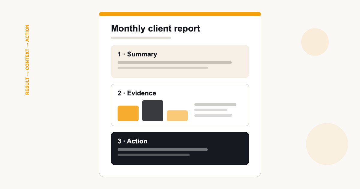
- Write the executive summary in result, context, action order — never metric order.
- Use a five-line commentary template so every month, good or bad, gets the same treatment.
Contents
- Start with the decision contract
- Fix the reporting period before anything else
- Write the executive summary in result, context, action order
- Build a KPI hierarchy: outcomes first, diagnostics second
- Label every figure's source — and say what is missing
- A commentary template that survives bad months
- Report poor performance without overclaiming cause
- Run the review meeting like an agenda — and use a pre-send checklist
Most monthly client reports fail quietly. They arrive on time, contain accurate numbers, and still produce the dreaded reply: “Thanks — so what does this mean?” The problem is rarely the data. It is that the report was assembled as a record of activity rather than as an input to a decision.
This guide gives you a structure you can reuse for every client: agree what the report is for before you write it, fix the period so numbers compare cleanly, lead with an executive summary written in decision order, and use a commentary template that keeps working when the month went badly.
Start with the decision contract
Before opening a dashboard, answer two questions: who reads this report, and what can they actually change? A marketing director can reallocate budget; a business owner can approve spend, sign off strategy, or ask for a different focus. The report exists to serve those decisions — anything that does not inform one is decoration.
Write the contract down once per client: the reader, the decisions in scope, the cadence, and the two or three outcomes they are paying you to move. Every monthly report then becomes an instalment in that conversation rather than a fresh document you invent from scratch.
- Reader: name or role, and how technical they are.
- Decisions in scope: budget, channel mix, creative, priorities.
- Cadence: monthly, with a fixed send day and a review call if there is one.
- Outcomes: the few numbers the retainer is judged on.
Fix the reporting period before anything else
Comparisons only work when the periods are comparable. Pick a reporting window — usually the previous calendar month — and hold to it across every section and every source. Mixed windows are the most common way accurate numbers produce wrong conclusions.
Two details do most of the damage. First, timezones: GA4 reports in the property timezone while ad platforms report in the account timezone, so “March” can start and end at different instants across sources. Second, partial periods: a month that ends mid-flight includes a final day with incomplete data. Exclude partial days or state clearly that the last day is missing — do not let a half-counted day look like a decline.
The same discipline applies to currency. If a client sells in GBP but advertises across regions, pick one reporting currency and note it on the report. A currency symbol changes presentation, not exchange rates.
Write the executive summary in result, context, action order
The first page is the only page many readers see. Structure it so a skim works: the result first, the context second, and the action third. A reusable writing prompt is: “The main outcome changed by [amount]. The strongest supporting evidence is [source or segment]. We propose [next step], owned by [person].” Fill the placeholders only once the figures and interpretation are checked.
Resist the urge to write the summary in metric order — sessions, then clicks, then conversions. Metric order forces the reader to do the synthesis. Decision order does it for them, which is the entire job of an executive summary.
Build a KPI hierarchy: outcomes first, diagnostics second
Not every number deserves equal billing. Outcome metrics — leads, revenue, signups — are what the retainer is judged on and belong at the top. Supporting diagnostics — sessions, CTR, impressions — explain why outcomes moved and belong underneath each outcome they support.
A useful test: if a metric improved but no outcome changed, would you lead with it? If not, it is a diagnostic. Ranking the report this way stops vanity metrics from crowding out the numbers the client is actually buying.
Label every figure's source — and say what is missing
The same business produces different totals in different tools, and all of them can be “right” under their own definitions. Label each section or figure with its source — GA4, Google Ads, the store, manual entry — so a discrepancy later is a definition question, not a trust question.
Say what is missing, too. If Instagram figures were entered manually from Insights this month, or a connection lapsed mid-period, note it beside the section. A gap declared in the report is a footnote; a gap discovered by the client is a credibility problem.
A commentary template that survives bad months
Commentary is where the report earns its fee, and where it is most often skipped when time is short. A fixed five-line template keeps the quality floor high, because the structure does the thinking when you are busy.
- What changed: the movement, with the number attached.
- Evidence: which metric or source shows it.
- Possible explanation: your best hypothesis, labelled as one.
- Next step: what you will do or watch as a result.
- Owner: who is doing it — you or the client.
Notice the third line says possible explanation, not cause. You are allowed to say “the likely driver is X” while checking it; you are not allowed, by the data, to declare certainty you do not have.
Report poor performance without overclaiming cause
Bad months are where the template pays for itself. Show the decline plainly, give your best hypothesis with its evidence, and state what you are doing about it. Clients forgive a bad month with a plan; they do not forgive discovering the bad month themselves.
Run the review meeting like an agenda — and use a pre-send checklist
If there is a review call, the report is its agenda. A fifteen-minute structure that works: results against targets (5 min), what drove them (5 min), decisions needed now (4 min), next month's priorities (1 min). Send the report early enough that the client has read it — the meeting should start at questions, not page one.
| Section | Contents | Purpose |
|---|---|---|
| Executive summary | Result, context, action in three short paragraphs | The decision page for skimmers |
| Goals & KPIs | Outcome metrics vs targets, trend over periods | Accountability against the contract |
| Channel detail | Per-channel metrics, each labelled by source | Evidence behind the summary |
| Work completed | What was shipped, launched or fixed | Connects your activity to the data |
| Next actions | Priorities and owners for next month | Turns the report into a plan |
| Methodology | Period, timezone, sources, manual entries, gaps | Pre-answers every 'where did this number come from' |
Finally, run the same pre-send checklist every month: correct client and properties, period right with no partial days, totals reconciled against sources, manual entries labelled, share link tested while logged out, and the schedule or approval confirmed. Ten minutes of checking is cheaper than a correction email.
ReportingBee is built around exactly this workflow: a reusable branded layout, connected metrics refreshed before the send, manual widgets for sources without live coverage, and scheduled delivery of the report link once you have reviewed it. See how it handles the full deliverable on the client reporting software page, or the account-manager narrative across channels on marketing agency reporting.
Sources
Related guides
Put it into practice
ReportingBee turns connected marketing data into branded client reports — refresh the figures, write the commentary, send the link.