In brief
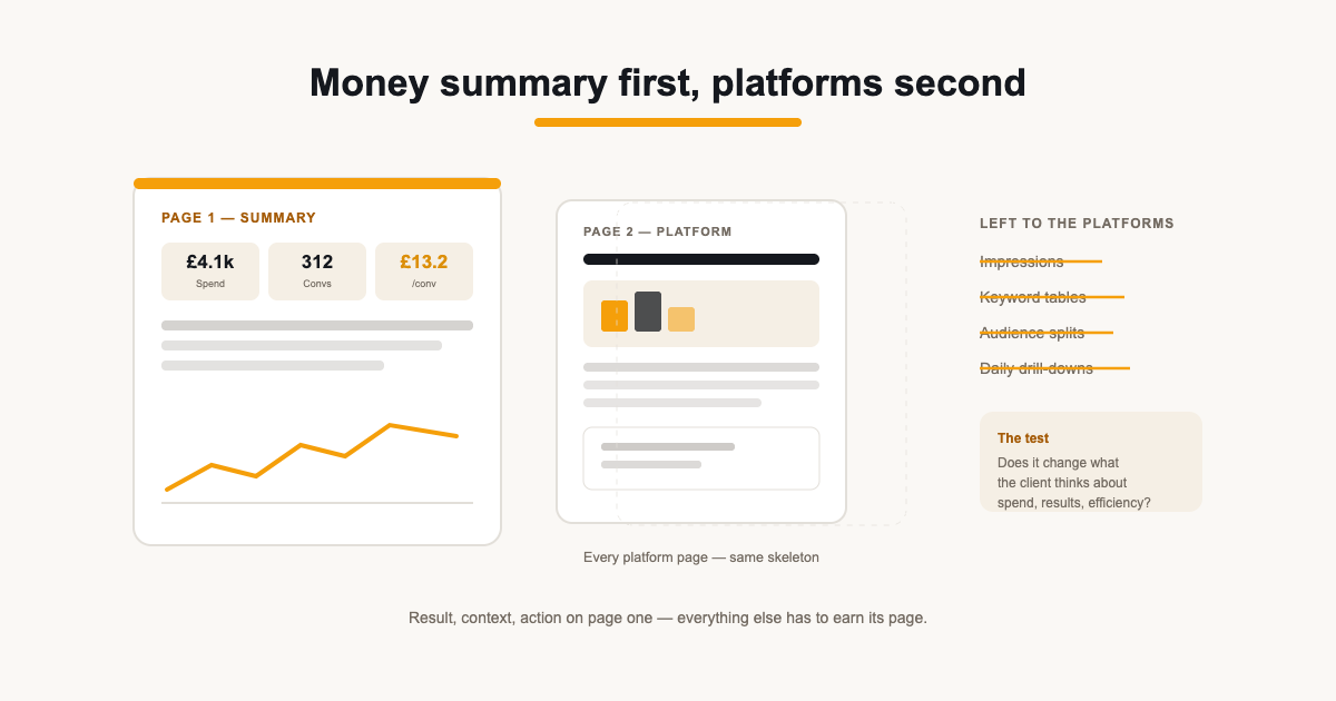
- Page one answers the money question: what we spent, what it bought, whether it was efficient.
- Every platform page uses the same skeleton so the client's reading pattern transfers between them.
- Commentary explains deltas and decisions — anything that restates a visible number is waste.
Contents
PPC reports fail in a specific way: they are organised like the ad platforms' own navigation — campaigns, ad groups, keywords — when the client's first question is simply 'what did we get for the money?'. A report that buries spend and results behind platform-structure detail gets skimmed, then ignored, then questioned in a call that could have been an email.
The structure below is built the other way round: money first, platforms second, detail last. Every page answers a question in the order the client asks it.
Page one answers the money question
The executive summary is not a chart dump — it is three numbers in order: total spend across platforms, the results it bought (conversions, revenue or leads, whichever the client measures), and the efficiency number that ties them together (cost per conversion or ROAS). If the client reads nothing else, they should know what they paid, what it produced, and whether that is better or worse than last month.
Put the deltas on the page. '£4,120 spend, 312 conversions, £13.21 cost per conversion (was £15.04)' is a complete month in one line. The same three numbers written as a sentence — result, context, action — is the executive summary proper. If a client forwards nothing but that page to their board, the board still knows what happened.
Platform pages on the same skeleton
Each platform gets one page, and every page uses the same layout: spend and result at the top, the trend chart in the middle, the breakdown table at the bottom, one short commentary block. When Google Ads, Meta and Microsoft Advertising all read the same way, the client's eyes learn the report once. The platform rows differ; the grammar never does.
- Headline row: spend, conversions, cost per conversion, ROAS where revenue is tracked.
- Trend: the same metric plotted across the period — direction first, magnitude second.
- Breakdown: top campaigns or ad sets by result, not by spend. Spend is how you audit; results are why the client reads.
- Commentary: two lines — what moved, what you did about it.
What to leave out
Impressions and clicks belong in the platforms, not the report — a client cannot spend them, and reporting them flatters activity without evidence. Campaign-level tables beyond the top few, keyword detail, and audience splits are all analysis surfaces: keep them in the ad platform (or a live dashboard if the client wants to dig) and keep the document for the answers.
The test for any widget is the money question: does this number change what the client thinks about spend, results or efficiency? If not, it is decoration — and decoration is what trains clients to stop reading.
This is also where the document earns its difference from a dashboard. The dashboard can hold the drill-down — the client who genuinely wants keyword-level tables gets a live view to explore. The report is the curated layer on top: it carries what you chose to surface, and the discipline of leaving things out is exactly what a client is paying an agency for. Detail on demand, decisions by default.
Commentary that earns its place
Good PPC commentary explains the delta, not the number. 'Cost per conversion rose 12% because we expanded into a broader audience ahead of the sale period — efficiency should recover as it learns' is worth reading. 'This month we got 312 conversions' is not — the table already says that. Write the commentary last, after the data is stable, and write it for the client's question, not the platform's vocabulary: nobody outside the agency says 'ad group performance' out loud.
The cover that does some work
The cover page is not decoration. It carries the client's name and branding, the exact period the numbers cover, and the send date — which is what makes the report citable. When a client forwards the PDF to their board, the cover is the page that says whose numbers these are and when they were true. Put the client's logo on it next to yours: co-branding the cover quietly makes the report theirs, which is half of what white labelling is for. A cover that carries a name, a period and two logos is doing work.
Weekly pacing is a different report
The monthly report is a review; the weekly send is a pacing check. Do not squeeze both into one document. The weekly version is three numbers — spend so far, result so far, pacing against target — and exists to catch overspend or a dead campaign mid-flight. The monthly version is the structure described here. Clients who want both get two short artefacts on different schedules, not one long report that does neither job well.
How the structure handles a bad month
Efficiency drops, costs rise, a campaign stalls — the structure does not change. The money summary still leads with the number, the delta is still visible, and the commentary does the heavier lifting: what happened, why it happened, what you are doing about it. A report that only looks trustworthy in good months is not a report; it is marketing. Same skeleton, honest numbers, sharper commentary — that is the version that keeps the account.
Numbers that reconcile, or a footnote that explains why not
Clients will eventually put two numbers side by side and find they disagree — Google Ads conversions next to GA4 key events being the classic pair. The structure survives that because it names its sources: a metric labelled 'Google Ads — conversions' is honest about whose definition it uses. Where two systems measure the same thing differently, a single footnote in the report ('conversions counted by Google Ads attribution — see the GA4 page for the site's own count') prevents the entire category of 'your numbers don't match' emails.
That footnote is not boilerplate — it is the difference between a report that holds up under scrutiny and one that collapses on the first hard question. Define the period on the cover, name the source per metric, and let the reconciliation be a fact of the document rather than a surprise in a call.
Sources
Related guides
Put it into practice
ReportingBee turns connected marketing data into branded client reports — refresh the figures, write the commentary, send the link.